Ludwig Baldass, ‘Some Notes on the Development of Van Dyck’s Portrait Style’, first published in Gazette Des Beaux Arts, vol. 50 (November 1957), pp. 251-270, edited and updated by James Innes-Mulraine and Justin Davies, with an introduction by James Innes-Mulraine.
How to cite: Baldass, Ludwig “Some Notes on the Development of Van Dyck’s Portrait Style” In Jordaens Van Dyck Panel Paintings Project. Edited and updated by James Innes-Mulraine and Justin Davies, with an introduction by James Innes-Mulraine.
http://jordaensvandyck.org/article/some-notes-on-the-development-of-van-dycks-portrait-style-ludwig-baldass/ (accessed 10 July 2026)
James Innes-Mulraine
The Austrian scholar Ludwig Baldass (1887 – 1963) enjoyed a distinguished career as a historian of early Netherlandish painting, lecturing at the University of Vienna from 1926 until 1949. Baldass’s conduct between the Anschluss with Germany in 1938 and his retirement is a blight on his reputation, however. While other art historians were forced to flee Austria, Baldass remained in post and supported the artistic policies of the new regime, including the misappropriation of artworks from Jewish collectors.a Publishing an article by such a man is not undertaken lightly. We must hope that Baldass interrogated himself in later life as we his readers do today. Perhaps there is some sign of it by the 1950s with his friendship and support for the painter Marie-Louise von Motesiczky, who had emigrated to Holland in 1938 and whose brother had died in Auschwitz in 1943 where he was imprisoned for his opposition to the Nazis, and for sheltering Jewish friends at his house.b,c
Baldass’s insightful scholarship has been central to modern Memling studies since the publication of his monograph Hans Memling in 1942. The books he wrote in retirement, Jan Van Eyck 1952, Hieronymus Bosch (1960) Giorgione (1965) are considered his best work.
In 1957 Baldass published ‘Some Notes on the Development of Van Dyck’s Portrait Style’ in the Gazette Des Beaux Arts. This relatively unknown article, written in 1948, makes perceptive distinctions between the style of Rubens and early Van Dyck. The reattributions remain valid today. The descriptions of technique and artistic character are elegant and succinct, expressing his connoisseurship in clear, memorable language. The perceptive analysis of Van Dyck’s courtly ideal and his development as a court painter is of great value to students of Van Dyck’s English career, and British painting subsequently. At the core of the article are Baldass’s detailed observation and sheer appreciation of the portraits by Rubens and Van Dyck in the Liechtenstein Collection. He resolves an old misattribution and reveals the Van Dycks in the collection to be among the painter’s greatest achievements as a portraitist.
We are grateful to The Princely Collections, Liechtenstein for assisting us in preparing this article by providing a set of images of unsurpassed quality and size. Baldass’s article was originally illustrated with only nineteen black and white photographs. Thanks to modern technology we have been able to source and show all fifty-one works mentioned in the text with high resolution colour images.
Ludwig Baldass
The portrait style which the young Anthony Van Dyck developed around 1620 exercised the greatest and most enduring influence on the art of portrait painting of the 17th and 18th Centuries. In the portraits of van Dyck’s the cavalier ideal of that epoch is given clear expression for the first time. All persons, regardless of whether they are princes, secular or clerical dignitaries, merchants or artists, have the same serene and benevolent air, the same dignified and easy-going postures. We realise clearly that it is not the representative of a certain social class who is shown, but the man or woman of the world; in other words, a person who, first of all, wished to impress the observer with his good breeding, who controls his passions, who leaves his cares at home, and who indulges in feelings only if they are compatible with a dignified bearing. If the well-dressed sitter is shown with some sort of an object, such as a musical instrument, a marble-bust or a globe, this does not necessarily mean that such an object has any connection with the vocation or profession of the portrayed person, but may just as well serve to point out one of its favourite hobbies. By a pleasant expression, a comfortable and easy, but never slovenly posture, the painter wished to express harmony in the mode of life. The primary aim is to impress the observer with the fact that he is viewing the portrait of a gentleman or a lady.
Portrait painting at the beginning of the 17th Century in Catholic-remained Flanders followed the same bourgeois lines as it did in Holland. It was from this realistic style of portrait painting that van Dyck developed the new, idealistic style. At no other place in the world were we able to trace the slow development of that style better than at the picture gallery of Prince Liechtenstein, with its long series of examples. There, we were offered the unique opportunity to study the gradual transformation of style in works of the same type, i.e., three-quarter length portraits of persons in quiet costumes.1
During the latest decades the earliest of these paintings were alternatively claimed for van Dyck and for his master Rubens. It is therefore necessary to discuss once more the question of authorship.
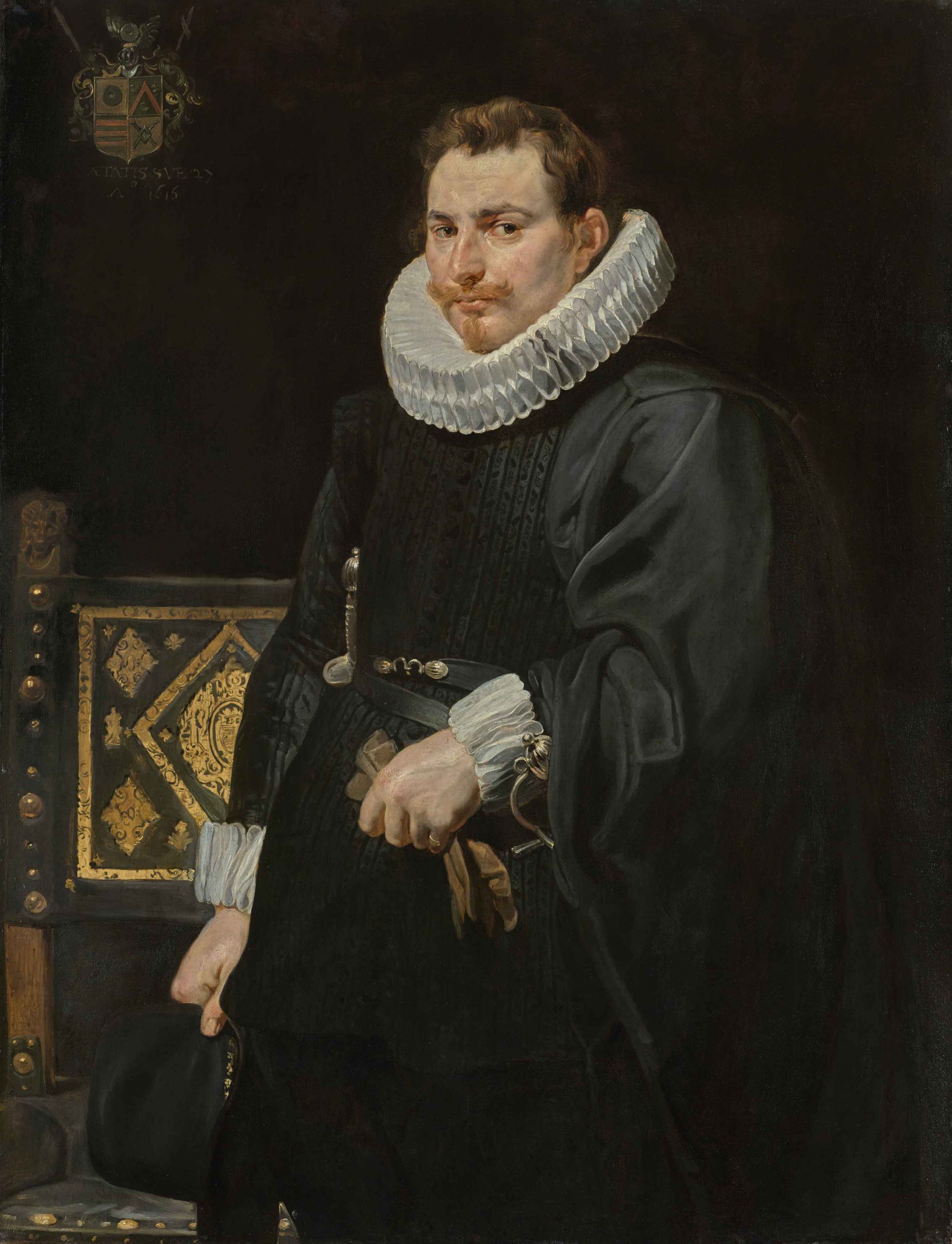
The earliest of these pictures (fig. 1) shows the date Ao 1616, and the age Aetatis Sue 27 below a coat-of-arms in the left background (not at the right, as was sometimes erroneously stated). On the basis of the coat-of-arms and the age, Max Rooses identified the portrait as that of Jan Vermoelen born 1589 at Antwerp, a sea captain and later Admiral of the Spanish Fleet in the Netherlands.2 Wilhelm Bode wrote in 1888: “Every inch of this painting is a Rubens”.3 Rudolf Oldenbourg, in his handbook, Die flämische Malerei des siebzehnten Jahrhunderts, published during the First World War, counted it among Rubens’ paintings “of striking truthfulness”.4 He did not, however, include it in his Rubens volume Klassiker der Kunst which appeared in 1921, shortly after his death, but laconically noted: “von van Dyck”. In the van Dyck volume of the same series by Gustav Glück (1931), however, we find it listed. The author, in this connection, quotes a remark contained in an inventory of 1656 attached to a last will, where a Portrait of Jan Vermoelen painted by van Dyck is mentioned. Hans G. Evers, in his book Rubens und sein Werk, Brussels, 1943, makes no mention of Oldenbourg- Glück’s new classification, he lists the painting as one of Rubens’ in his chronological table of the year 1616.
The inventory note does not contain any description of the painting. Quite apart from a possible mistake in the authorship by the anonymous writer of the inventory, it is also possible that this admiral of the Spanish Fleet was painted in later years by van Dyck and that he gave that portrait now lost to his brother in Antwerp. The identity of the painting in the Liechtenstein Gallery with that mentioned in the inventory is not substantiated by any kind of evidence. The only criterion by which it might be attributed to either Rubens or van Dyck must solely be the characteristics of the style.
Two principal factors must be taken into consideration: the composition of the painting and the method of colouring.
The composition of this painting shows Rubens’ painting style of the second decade of the 17th Century. Oldenbourg in his handbook was quite correct in listing the painting of the Liechtenstein Gallery of the year 1616, between the male portrait at Brunswick (fig. 2) and that of Dr. Hendrik van Thulden, at Munich (fig. 3).
The twenty-seven years old officer faces us in a simple pose. A glossy black background closes the composition. Only a big, carved chair, with gilt ornaments on the dark green leather of the back indicates space. The main accent is on the head, which is well set off by a millstone collar. The lively and searching look rests on the observer. No importance is attached to the movement of the hands.
This style of composition was adopted by Rubens immediately after his return to Antwerp from Italy. Jacob Burckhardt has already pointed out that in portraiture Rubens had taken over a great and direct Netherlandish inheritance.6 The old Flemish tradition, which may be traced back to Frans Floris and which, in the paintings of the younger Frans Pourbus, was still alive at the beginning of the 17th Century, impressed Rubens most deeply after his return from Italy.
The two portraits of Archduke Albrecht and his consort are the first clear testimony (figs. 4, 5).
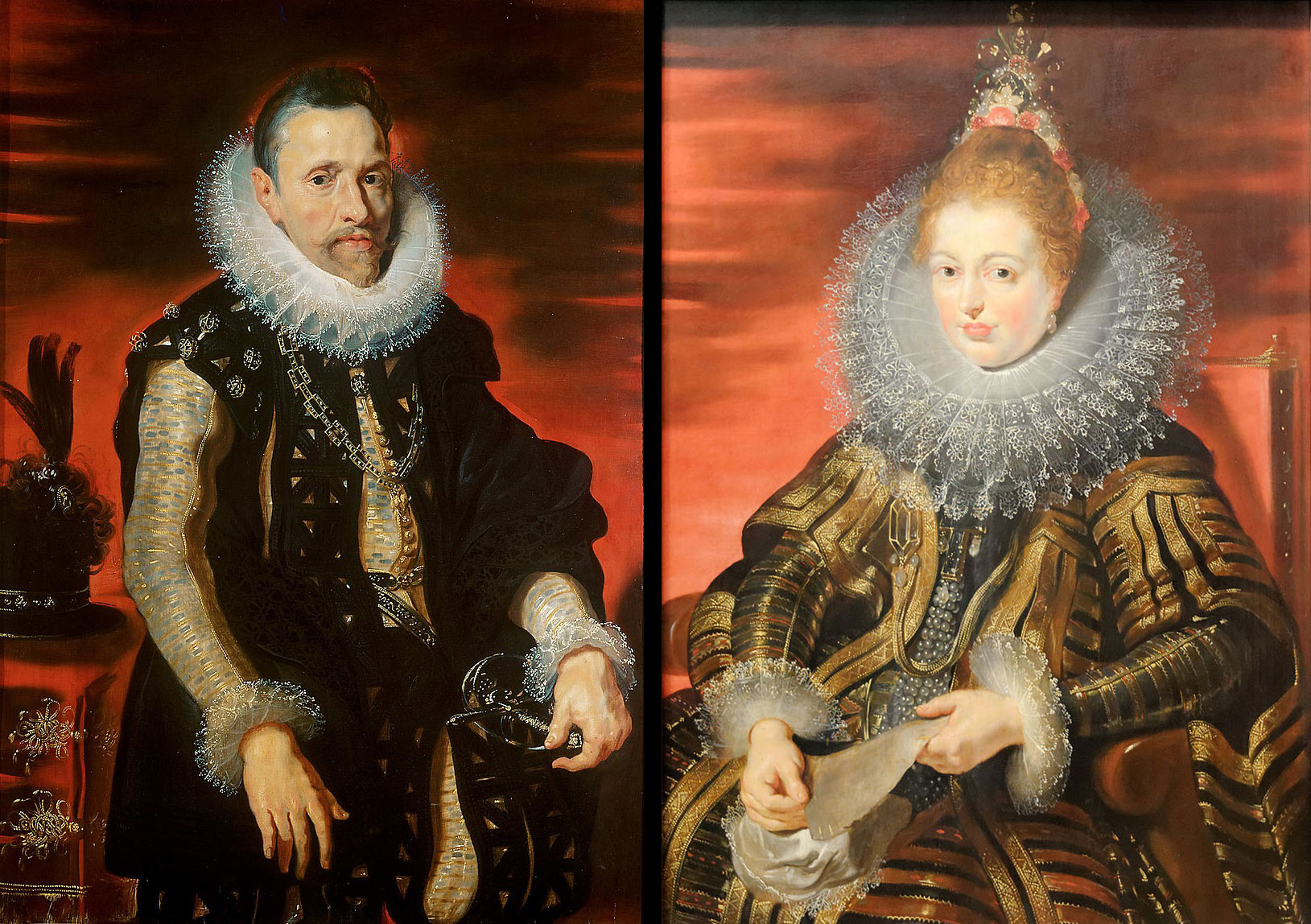
In the archducal couple at Vienna we miss any trace of the Venetian elements, which were not yet recognizable in Rubens’ early Genoese portraits of women but clearly evidenced in the portraits of the Gonzaga family painted at Mantua (figs. 6, 7).
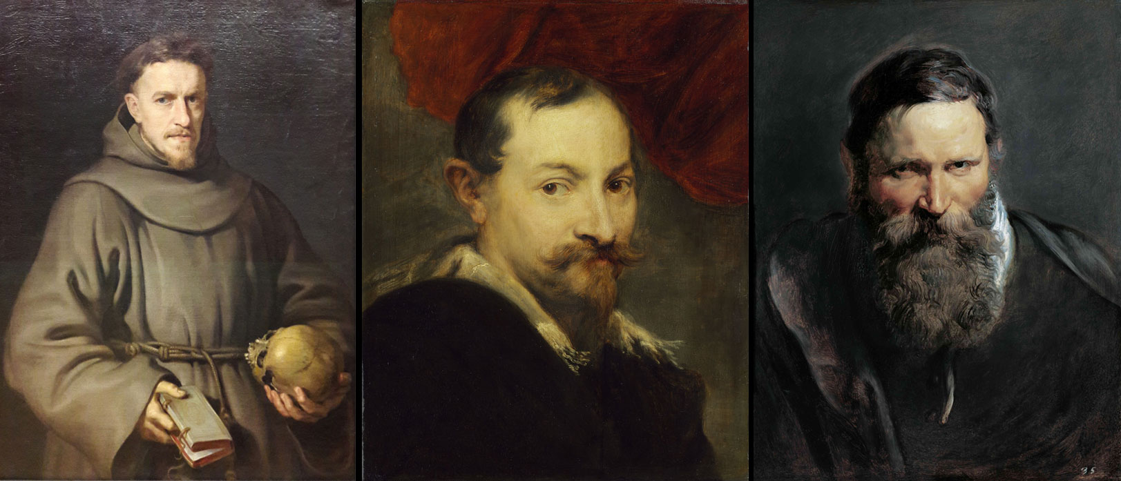
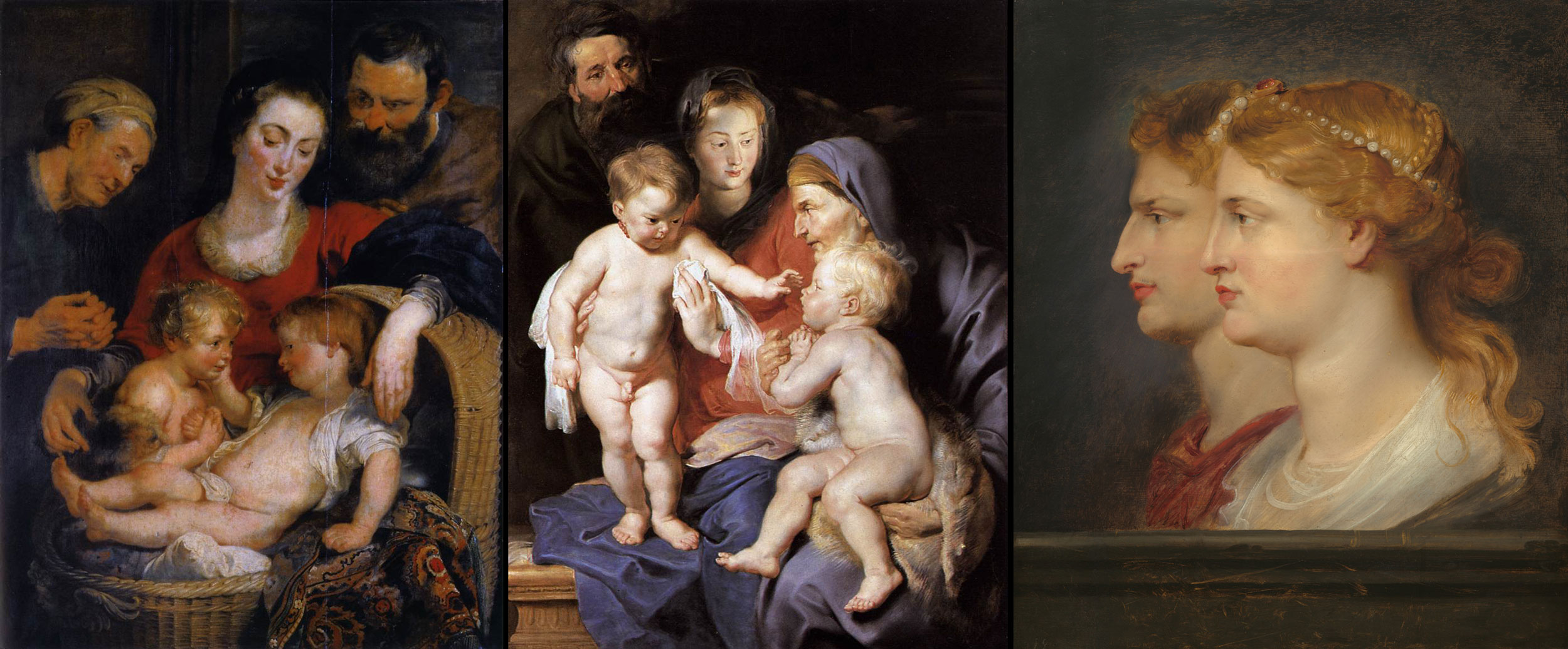
When he later painted the portraits now in Brunswick, at the Liechtenstein Gallery, and in Munich, Rubens dispensed with the flaming red background, which was probably neutralized by a brown transparent glaze. Subsequently, however, he returned to the red background, as we will discuss later. This portrait style of Rubens’ first Antwerp period, which incidentally had a decisive influence on Frans Hals, sees its primary task in the vivacious representation of the sitter. It is characterized by the realism without pose, or without that emphasis on particular features that will be noticeable in van Dyck later. Particularly typical of Rubens is the unusual vitality conveyed by the sitters. We encounter it again in the Portrait of Franciscan Monk, in Munich (fig. 8), in the half-length Portrait of a Young Man, at Cassel (fig. 9), and in the Study of a Bearded Man, at the Liechtenstein Gallery (fig. 10), who repeatedly served Rubens as a model for Joseph the foster-father, seen in paintings of the Holy Family, in the Palazzo Pitti, Florence (fig. 11), the Wallace Collection, London (fig. 12), and a private collection in the United States.8

The colouring of the Portrait of Vermoelen (fig. 1), is very substantial and of great transparency. The oak panel, obviously, is coated with a thick, white priming of chalk, and the paint is applied in several layers. Shapes and contours still dominate the organization of the painting more strongly than the bright colouring. The latter is apparent in the lively black, and even more in the carnation. To see this, we only have to look at the reddish spots on the nose, cheek, and ear, the blue shadows at the temple so characteristic of Rubens, and the yellow lights on the red lips. This technique is already suggested in the painting of the profile heads of Tiberius and Agrippina, in the Liechtenstein Gallery (Editorial note: now in the National Gallery of Art, Washington as Germanicus and Agrippina, fig. 13).
The colouring of the Portrait of Vermoelen (fig. 1), is very substantial and of great transparency. The oak panel, obviously, is coated with a thick, white priming of chalk, and the paint is applied in several layers. Shapes and contours still dominate the organization of the painting more strongly than the bright colouring. The latter is apparent in the lively black, and even more in the carnation. To see this, we only have to look at the reddish spots on the nose, cheek, and ear, the blue shadows at the temple so characteristic of Rubens, and the yellow lights on the red lips. This technique is already suggested in the painting of the profile heads of Tiberius and Agrippina, in the Liechtenstein Gallery (Editorial note: now in the National Gallery of Art, Washington as Germanicus and Agrippina, fig. 13).
At first the artist only painted the head of Agrippina, then he enlarged the panel on the lower and left sides and added Tiberius’ head. The brush-stroke of the Vermoelen portrait recurs exactly the same way in the hair, eyes, etc., of the above-mentioned Study of the Head of a Bearded Man in the same gallery obviously painted after the living model (fig. 10). The Portrait of Jan Vermoelen, of 1616, must therefore be reclaimed for Rubens.
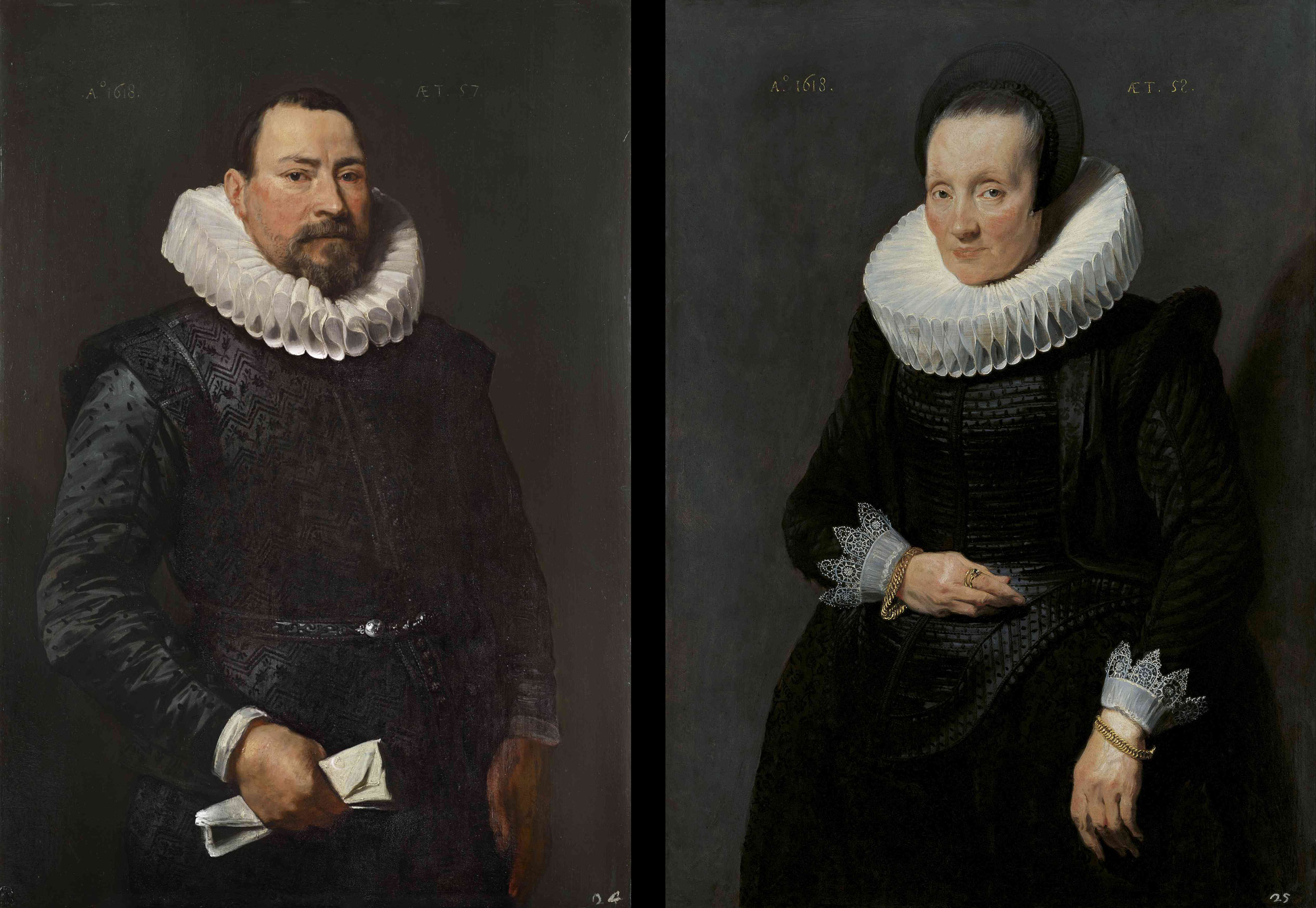
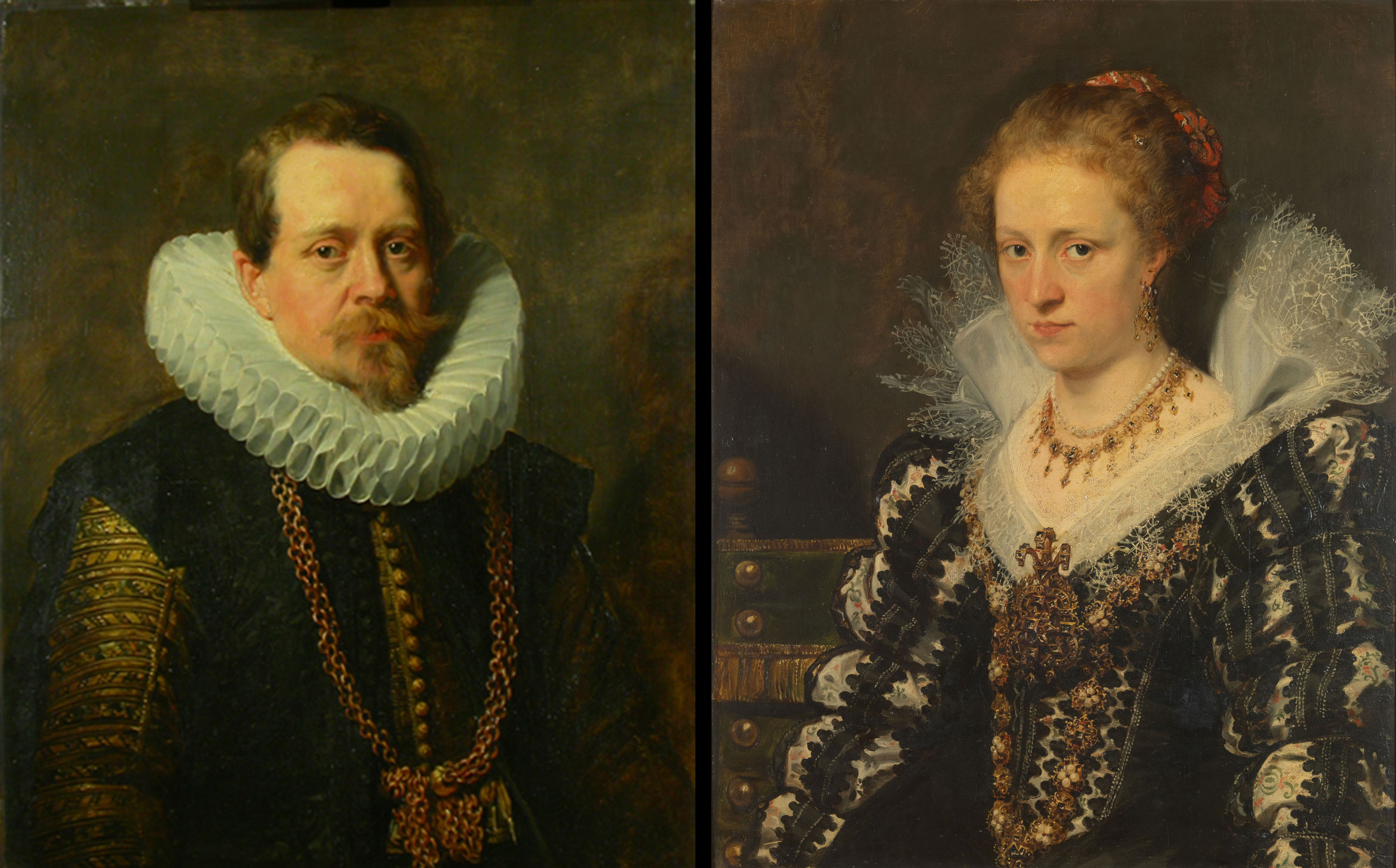
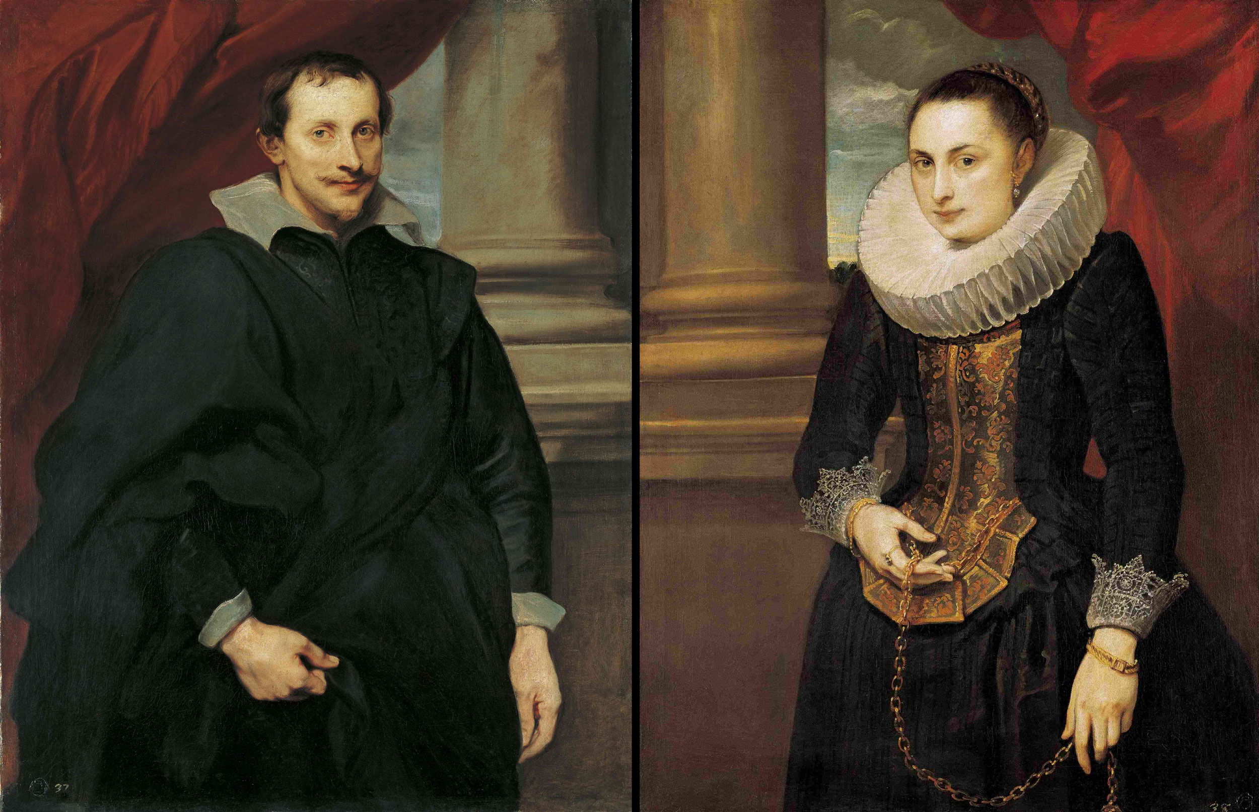
In the 19th Century (up to Waagen, 1866), three other portraits of the Liechtenstein Gallery were attributed to Rubens.9 Only in 1889 did Wilhelm Bode claim them for Van Dyck. In the case of a pair of portraits we see on the dark brown, neutral background, in the upper right-hand corner, the year when it was painted, Ao 1618, and on the left side the age Aet. 57 for the male (fig. 14) and Aet. 58 for the female sitter (fig. 15). They date from the year when van Dyck became a free master in Antwerp. We may safely assume that he made portraits before this time.
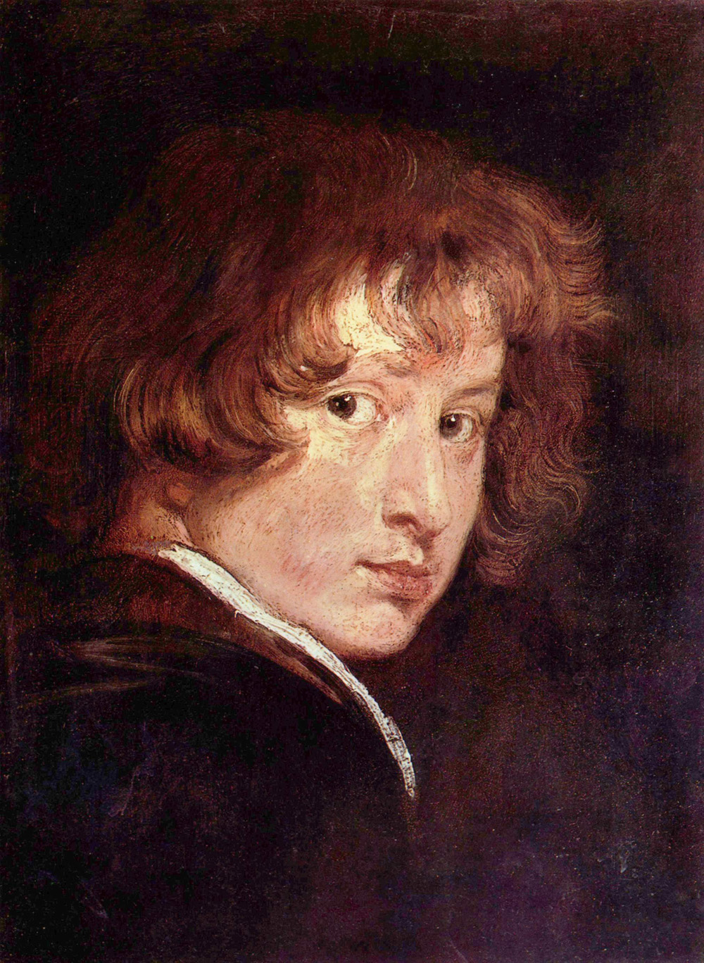
The small, youthful Self-Portrait, at the Vienna Akademie Galerie is proof for this (fig.16). But not before 1618 may we assume that he accepted orders for portraits.
The small, youthful Self-Portrait, at the Vienna Akademie Galerie is proof for this (fig.16). But not before 1618 may we assume that he accepted orders for portraits.
Both figures of the painting of 1618 are dressed all in black. The man wearing a cloth doublet with silk sleeves, the woman a silk dress with a burled bodice, the intense carnation is thus the only lively colouring of the paintings. The well-preserved sitters – the man in particular, whom we would hardly give fifty-seven years – are facing us in a simple attitude. We recognize in these portraits the same hand as seen in the Vermoelen portrait even more in the male portrait by Rubens at Brunswick. The substantial application of colour is proof of the mastery of technical means. Nevertheless, we see without difficulty that the paintings were made by another hand than the Vermoelen portrait. The application of colour in the reddish eyelids and the sparing use of the yellow lights is more hesitant, the forms are less plastic, and the hair is less loose. The brown underpainting is clearly discernible in several parts of the garments and in the unfinished left hand of the man. In the face of the woman the colours are more softened than is usual in Rubens and they are spread with a rather broad brush. The preliminary drawing is clearly visible in the female mouth. The male hand shows no veins; it is even somewhat coarse in its form. The loops of the white millstone collar, no longer double and showing deep shadows on the lower side, are drawn in one continuous calligraphic stroke, a characteristic which we are to encounter very often in van Dyck. Several impasto-spots in the handhe male portrait and in the piece of paper seem to have been applied rather hastily, just before finishing the picture. As von Bode pointed out, there is a certain soberness and also an inadequacy of design in these early works.
The greatest affinity to Rubens’ portrait style is revealed in a few other paintings by van Dyck in other collections. I merely mention those which I was lately able to study thoroughly again. There are two things by which we recognize the younger of the two painters. The first characteristic is that van Dyck’s different brush work is more ornamental than that of Rubens, on the one hand, and more blotted in the light spots on the other hand. The second however, stems from the difference in temperament, the lesser vitality, the greater human distance between the artist and the portrayed sitter. The more nervous, sometimes exalted trend, however, which we encounter frequently in later van Dyck’s paintings is not noticeable in his first portraits.
The two portraits of Jean-Charles de Cordes (fig. 17) and of his wife, Jacqueline van Caestre (fig. 18), in Brussels, count among the most beautiful of van Dyck’s early paintings. Wilhem Bode correctly listed them as by van Dyck. The artist’s mark is particularly present in the face of the richly and colourfully clad woman, whose pensive air anticipates impressions which the great portrait painter was to produce in later years. The artist’s technique is still more obvious in the male counterpart. In spite, or perhaps because of the impasto application of colour, we can still state uncertainty as to the form, particularly in the formation of the ear and the drawing of the brocade of the sleeve. The highlights are placed impulsively. While the beard is treated by purely graphical means, the double-loop millstone collar, as the hair on the head, was merely formed as a mass without structure. Each section of the collar was subsequently separated from the adjoining ones by light-coloured, disjoined strokes.10
In these works, too, we recognize once more the close adherence to the portrait style of the great Rubens. I merely mention the style relationship with Rubens’ half-length Portrait of Baron de Vicq in the Louvre (fig.19).
The work is dated in the middle Twenties for external but not necessarily cogent reasons. I am indebted to Ludwig Burchard for the information about the date of the picture having been based on a passage in Histoire de la vie de Rubens by J.F.M. Michel (Brussels, 1771).11 Judging by the style, one would be inclined to date the portrait of the Flemish diplomat, born in 1573, and of an unusually firm posture, at the end of the second decade. In any case, it shows Rubens’ conception of portrait painting in that period. The simplicity of the design is of convincing forcefulness. Here, Rubens again returns to the red background of the early period.12
The young van Dyck, still experimenting, is inclined to be more reserved and more timid than his master; on the other hand, he shows occasionally more of the soul of the sitter as he believes he sees it.13 The Portrait of Jacqueline van Caestre (fig. 18) is a good example of this. Van Dyck was breaking away from Rubens’ style only slowly and gradually. We can easily trace it if we turn back to the portrait in the Liechtenstein Gallery.
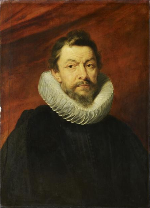
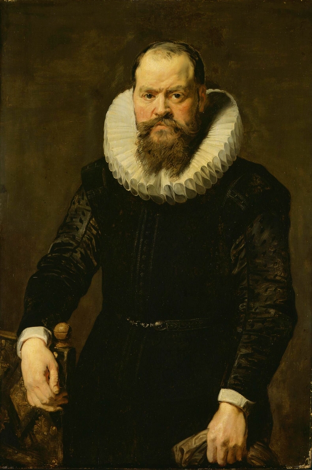
In the last of those of van Dyck’s portraits, that were formally attributed to Rubens, the portrait of an elderly, very self-assured gentleman, who stands beside chair (fig. 20), the clumsiness still characteristic of the two portraits of 1618, is wearing off.
The technique now becomes more superficial. In comparison with the above-mentioned counterparts in the same gallery, the “under paint” plays a lesser part in the effect. The black of the garments is more colourful. The chair is almost colourlessly grey; the ornament, contrary to Rubens’ Vermoelen portrait, is only slightly indicated. The collar, although less richly toned than in the two companion-portraits of 1618, is warmer in tone, which is due to the absence of the blue shadows. Hair and beard, as in the Portrait of Jean-Charles de Cordes, Brussels, and in the Portrait of Baron de Vicq by Rubens, in Paris, are almost wholly done in parallel strokes of the brush and show an ornamental quality similar to that of the collar. The tranquil mood of the entire composition relates it closely to the male portrait by Rubens at Brunswick.
A certain superficiality of execution is noticeable in the hands, the less richly toned collar and the obviously hasty modelling of the head. In the method of colouring, therefore, we see a departure from van Dyck’s pure Rubens style as exemplified in the companion portraits of Brussels and in those of 1618. The Portrait of the Man with the Armchair, therefore, must be somewhat later than the companion-portraits of 1618. The greater superficiality is coupled with a more elegant design.
The next works already show a change, although the technique, on the whole, is the same; only the ground is no longer wood but canvas. First, there are two companion-portraits (figs. 21 and 22).
The neutral background no longer seems sufficient to van Dyck. He places the youthful sitters in front of the bases of mighty columns: he employs large, red and billowing curtains.14He shows pieces of blue sky with white clouds between the curtain and the column, a motif used by Rubens on his stay in Genoa and later-in his Medici portraits in the Louvre (figs. 23, 24).15
Van Dyck – the interesting point being that this is done prior to his Italian period – wants to convey the impression that the painted persons, shown in bourgeois costumes, are moving within palaces with large colonnades. It is in the accessory parts that the cavalier ideal finds its first expression.

The technique of these first formal portraits by van Dyck clearly follows, particularly in the face of the male portrait (fig. 21) and the handling of the elderly gentleman. Everything is meant to be viewed from a certain distance; the artist intentionally eschews the careful execution of details. The material characterization of the deep black garments is also done in a superficial manner. The unpretentious female portrait (fig. 22) is more colourful than its male counterpart. The lady wears a bodice of gold brocade which is trimmed in red, flower-like ornaments. We find a certain pleasure in elaborate details in the impasted hoop in the hair.
Nearly the same costume appears in a similarly composed Portrait of a Girl with the same pompous background of curtain and column. A chair placed at an angle gives a strong accent of space. At the first glance one might think that the garment (fig. 25) was copied from the other painting. On closer examination however, it becomes obvious, that the two costumes were painted from different models. The features of the two ladies show a great likeness. The jewellery, however, is different in each case, and the paintings, therefore, are not those of the same person, but of two sisters or close relatives. The modelling of the face in the single female portrait appears flatter, a fact which is solely due to the strongly yellowed varnish. In the garments the black has strong grey hues, which as we shall see later on, correctly corresponds to the further development of the artist.
It is striking that the pose of the two female figures is still that of the previous bourgeois period. The new ideal is merely indicated in the palace columns of the background. At this point, let me mention that it was only in the following Genoese period that the artist also learned to give his female sitters that elegant, easy posture with all its grandeur, so typical of the new style in portrait painting.
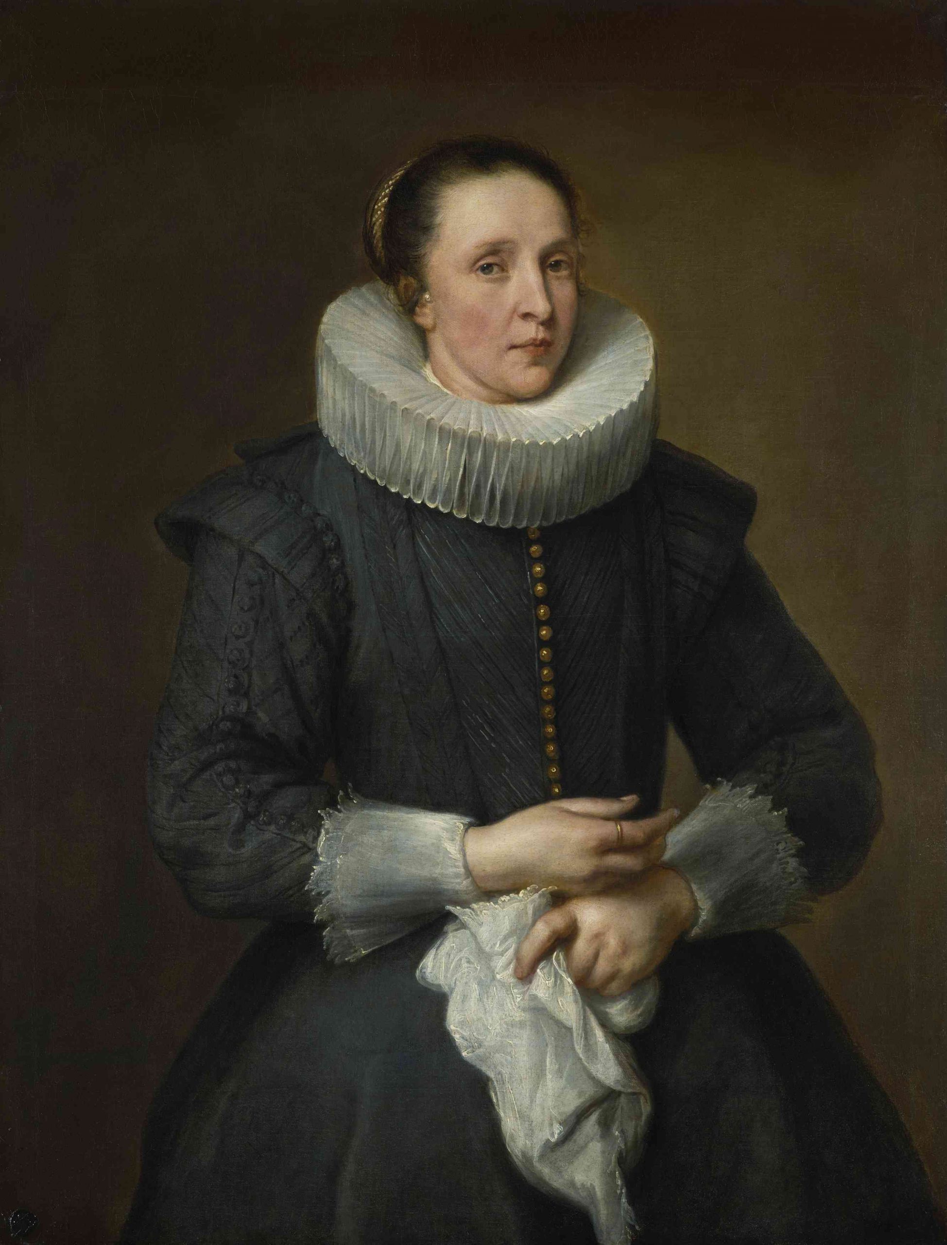
In the Portrait of the Lady in Grey (fig. 26), which bears a bourgeois note, van Dyck again returns to the monochrome background. It is of brownish tone this time. From now on van Dyck lets natural and pompous backgrounds follow each other in his portraits. The stroke of the brush still reminds us clearly of the Portrait of a Fifty-Five-Year-Old Man (fig. 20). The jagged criss-cross of the crumpled handkerchief, for instance, recalls the creases in the sleeve of the grey-bearded gentleman. The technique becomes less and less elaborate. The collar shows only the front loops in detail, the others are merely painted in a sketchy manner. The fact that the form of the hair ribbon is merely indicated by superimposed lights may be explained by the supposition that the portrait was painted after the two above-mentioned portraits of ladies in coloured costumes. The grey of the garments is enlivened only by the row of yellow buttons. The development becomes very rapid now. In opposition to the impasto technique of the hair in the portrait of the elderly lady (fig. 15), dated 1618, we find here an [Ed. Note – word missing in the original text] which the artist drew the hairs with a fine brush. It seems to me that the unpretentious appearance of the bourgeois woman dates the work before the Italian journey. G. Glück even holds that is was painted before the first trip to England in 1620. This view, in my opinion, comes nearer the truth than W. Bode’s, who classifies the portrait as having been painted during the second Antwerp period (i.e., after 1627).
W. Bode’s dating may be explained as follows: with full justification he thought the portrait of the gentleman with the pointed beard (fig. 27), not included in Glück’s Klassiker der Kunst, which seems to show a more mature and livelier conception, to be the counterpart of the Portrait of the Lady in Grey.
The very similar monochrome brown background would seem to corroborate that view; the new horizontal height of the eyes, lower in the man than in the woman, seems, however, to refute this opinion. The size of the painting, though, is no longer the original one. Seven and a half centimetres were added to the upper part of the female portrait. And nine and a half centimetres to the male portrait (both additions are now covered by the frames). If we assume that the male portrait was somewhat shortened on the lower side and the female one on the upper side, so that the female portrait originally was its present size with something added on top, while the male portrait formerly showed more of the body, we arrive at a size where both figures faced each other at the same height.
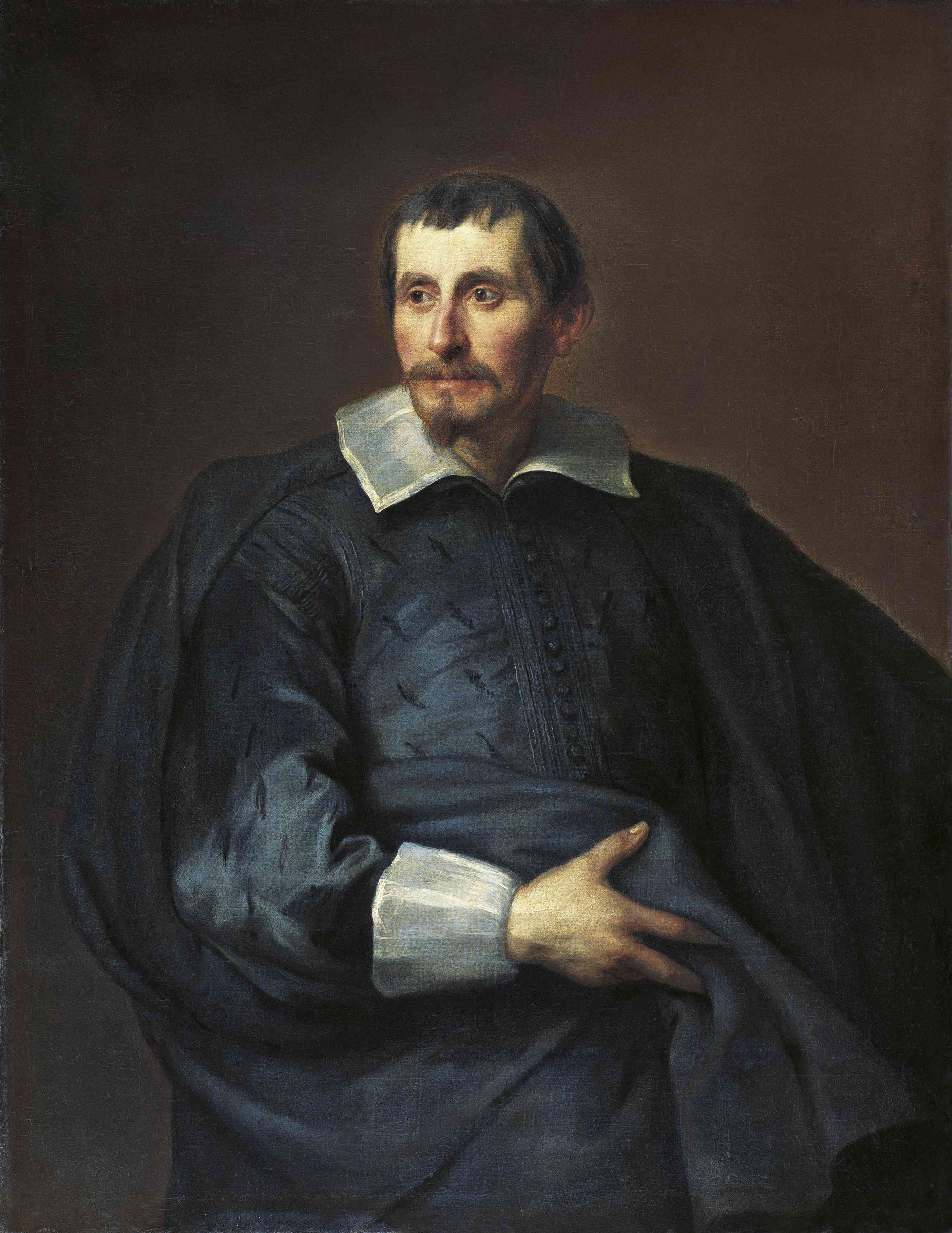
These two paintings by van Dyck, therefore, seem to belong together, even though the male portrait shows a more mature style; during that period, we can see the same thing in other companion portraits. The simple, but very effective posture of the gentleman with the pointed beard shows that momentary note by which van Dyck endeavoured to enliven his portraits at that time, namely, about or soon after 1620. It is the earliest portrait of the Liechtenstein Gallery where the model does not gaze at the onlooker but looks somewhere else for a moment. For the first time the cavalier ideal is not expressed by the background but by the posture, i.e. by the portrayed person itself. The pronounced material treatment of the silk doublet and the cloak of broadcloth, both of a black colour fading into grey, only rarely shows the stroke of the brush. Collar and cuffs are accentuated only by a few lights, particularly at the edges. The strong colouring of the face is done in reddish, almost violet, hues. The outlines of the dark head, set off against a lighter background, are almost as linear as in the Gentleman with the chair.
The momentary character of this portrait recurs in the excellent three-quarter length painting at the Jacquemart-André Museum, in Paris (fig. 28). The monumental construction has no adverse influence whatsoever on the vitality of the composition. The momentary note is particularly in the eyes; the model seems to look at us all of a sudden (fig. 12). The stroke of the brush, once again, is clearly recognizable. Van Dyck now is the sovereign master of all means and he applies them in different ways. In the painting at the Jacquemart-André Museum, we do not encounter the bold stroke of the brush which is mainly responsible for the charm of the portrait of the Antwerp art-collector, Cornelius van der Geest, still painted before the Italian trip, and now at the National Gallery, in London (fig. 29). Regrettably, it was too thoroughly cleaned in the recent past.
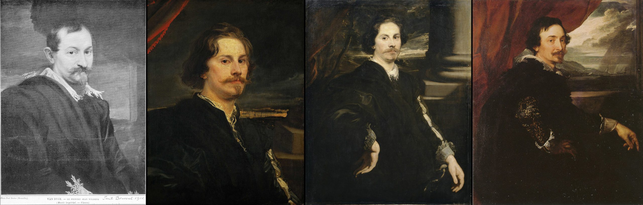
The well-preserved portraits in the Vienna Museum – the painter Jan Wildens (disappeared in 1945) (fig. 30) and, according to G. Glück’s assumption, the painter Paul de Vos [Editorial note – recently identified as the painter Pieter Soutman]16 (fig. 31) are painted by a bold stroke of the brush and remind us of Venetian works, particularly of portraits by Tintoretto.
Another version of the last-mentioned portrait of a man exists, as is known, in the Louvre (fig. 32). Contrary to the two portraits in the Vienna Museum, it is not shortened; it is again the portrait of a man in three-quarter length with a sword.17 It is painted with care and therefore goes into greater detail. It continues the style of the Portrait of a Young Man at the Liechtenstein Gallery. The motifs rise to grandiose forms.
This advance, on the pattern of Tintoretto’s art, reaches its climax in the marvellous portrait now at Brunswick, which, according to the inscription of a mezzotint, shows the Antwerp lover of fine arts, Lucas van Uffel, who resided in Venice (fig. 33).
We can see that the style of van Dyck’s first Antwerp period passes over to the Italian style almost imperceptibly. The stimulation through Venetian art, as evidenced in the two portraits in Vienna, which were nevertheless painted in Antwerp, and the Portrait of Lucas Van Uffel, probably painted in Italy, was only temporary, as we shall see at once. It is quite possible that van Dyck saw some of Tintoretto’s portraits while still in Flanders.
The first portraits painted in Italy, continue in the cavalier style, which van Dyck had already followed in Antwerp (fig. 27). The Catalogue of the Gulbenkian Collection, published by the National Gallery in London in 1937, with full justification classifies the wonderful Portrait of a Gentleman of that collection (fig. 34) at the beginning of the new period. Such freedom, greatness and naturalness of depiction, schooled in Venetian arts, seems only possible after the stay in Italy.
The beautiful half-length Portrait of the Marchesa Cataneo, in the National Gallery in Washington, once again, recalls Tintoretto’s excitable style (fig. 35). After that, however the Venetian influence recedes, and the old Flemish tradition continues to exercise its influence.
We see this very clearly in a work which certainly was painted during van Dyck’s stay in Italy: Portrait of a thirty-two-year-old nobleman with a blond, pointed moustache at the Liechtenstein Gallery, which reveals no influence of Italian art (fig. 36).
The carnation shows much pink and the cheeks are almost of the same colour as the lips, which are accentuated by yellow lights. The lace edges of the collar are drawn in ornamental lines. The garments are deep black and the fur collar of the cloak shows grey-blue lights.The basket handle is painted with bold, broad strokes and accentuated by impasted lights. The frame today covers up additions on top and below of three and two centimetres respectively. On the right side of the column we find the following inscription: AET 32, 1624 which is not adapted to the round shape of the column. The rest of the background is treated as a wall consisting of a dark brownish streak and a larger light grey area which turns somewhat darker towards the left edge of the painting. The brown back of the chair is placed transversely, but because of the hand in front of it, does not attract attention. Greater stress than in the pre-Italian portraits is placed on the strongly accentuated light effect of the hands. The man gestures with his right hand, which seems to give emphasis to a remark he just made. The eyes are turned away for a moment from the onlooker, so that the immediate effect of the movement of the hand is echoed on the face. This distinguished attitude bears that note of precocity, which, from his stay in Italy on will be characteristic of van Dyck’s portraits.
Only six years separate this masterpiece, displaying so much craftmanship, from the companion-portraits of 1618. In view of van Dyck’s premature, as well as productive, talent, these dates mark the beginning and the climax of his professional painting of portraits. With the aid of the paintings of the Liechtenstein Gallery we were able to trace the road which the artist followed during these six years. The numerous commissions for portraits soon forced him to abandon the laborious impasto technique of the companion-portraits of 1618 and to substitute a more superficial technique, hence granting his pictures a better effect from the distance.
Even before the journey to Italy the cavalier ideal became the principal artistic motif. Van Dyck associated his pompous backgrounds with the emphasis he puts on an intentionally easy posture and sometimes with a whole language of very remarkable gestures. The psychological expression is more profound in the studies which merely show the head of the model without his hands, than in the three-quarter length portraits with usually magnificent backgrounds. It is important to note that the Venetian influence appears only now and then in this period of van Dyck’s and that it influences the total effect only in his impressive full-length portraits, outside our subject.19

In three-quarter and half-length portraits, the most powerful factor is the Flemish tradition which goes back to Rubens and the Flemish portrait painters having gone through the Romanising styles during the second half of the 16th Century. How strong this tradition was is proved by the fact that, even after van Dyck’s return from Italy to Antwerp, in 1627, we see pompously composed paintings, as well as very simple ones in modest postures.
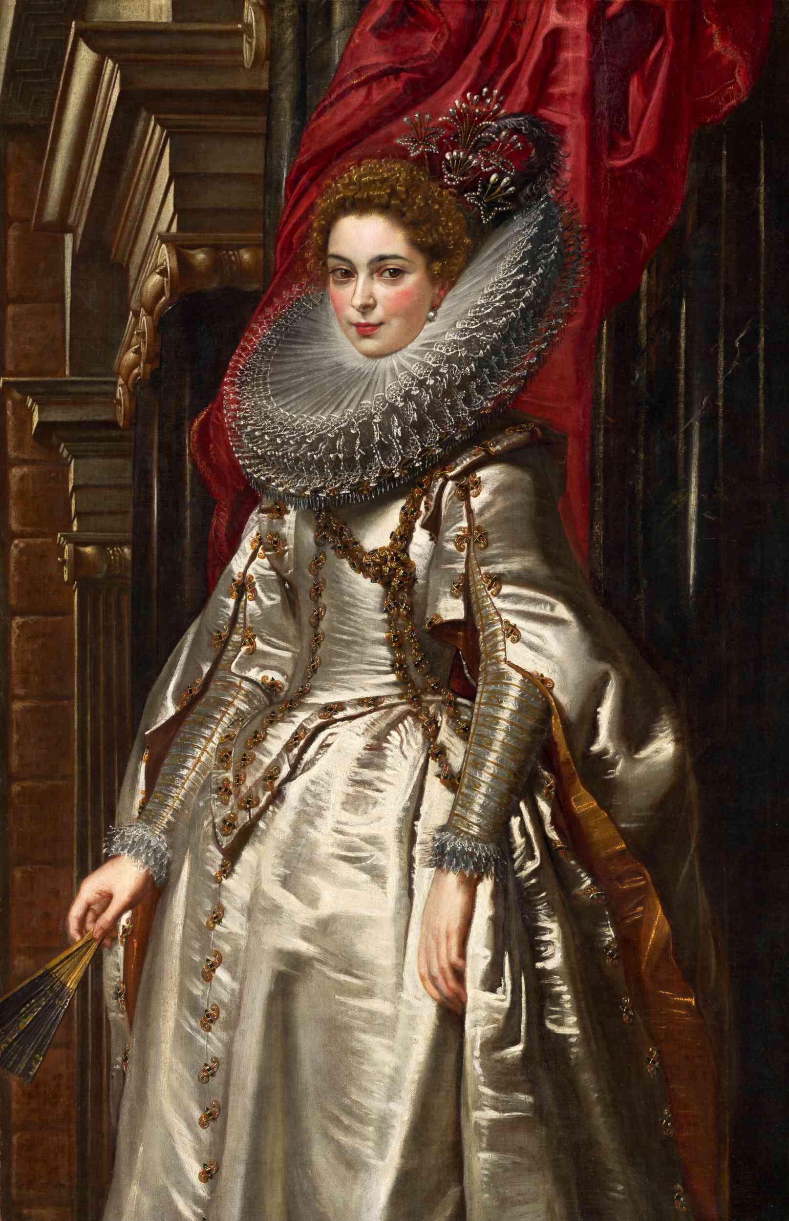
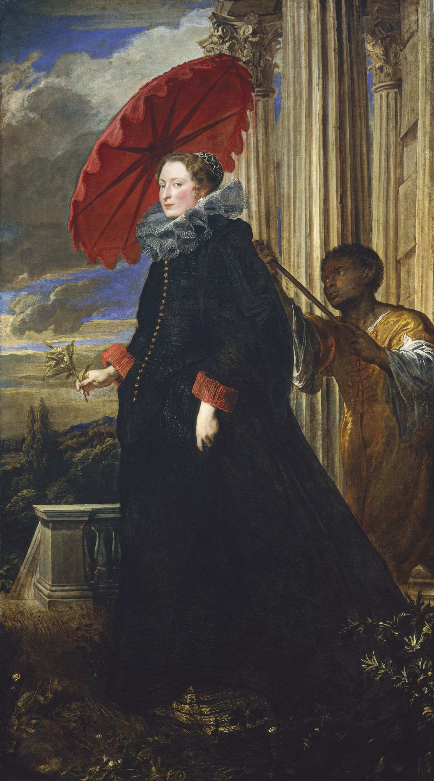
In the Liechtenstein Gallery portraits, the first type is represented by the charming portrait of the beautiful Marie-Louise de Tassis (fig. 16), the gorgeous splendour of her garments, clearly based upon the colours – white, black and yellow, with some lilac in the ribbons on the girdle and sleeves (fig. 37).
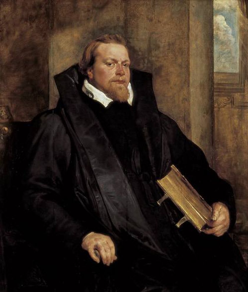
The other type is represented in a few half-length portraits which, unlike those of the earlier period, also show the hands. An example for this is the impressive portrait of the painter Gaspar de Crayer, in his magnificent and self-assured pose (fig. 38).
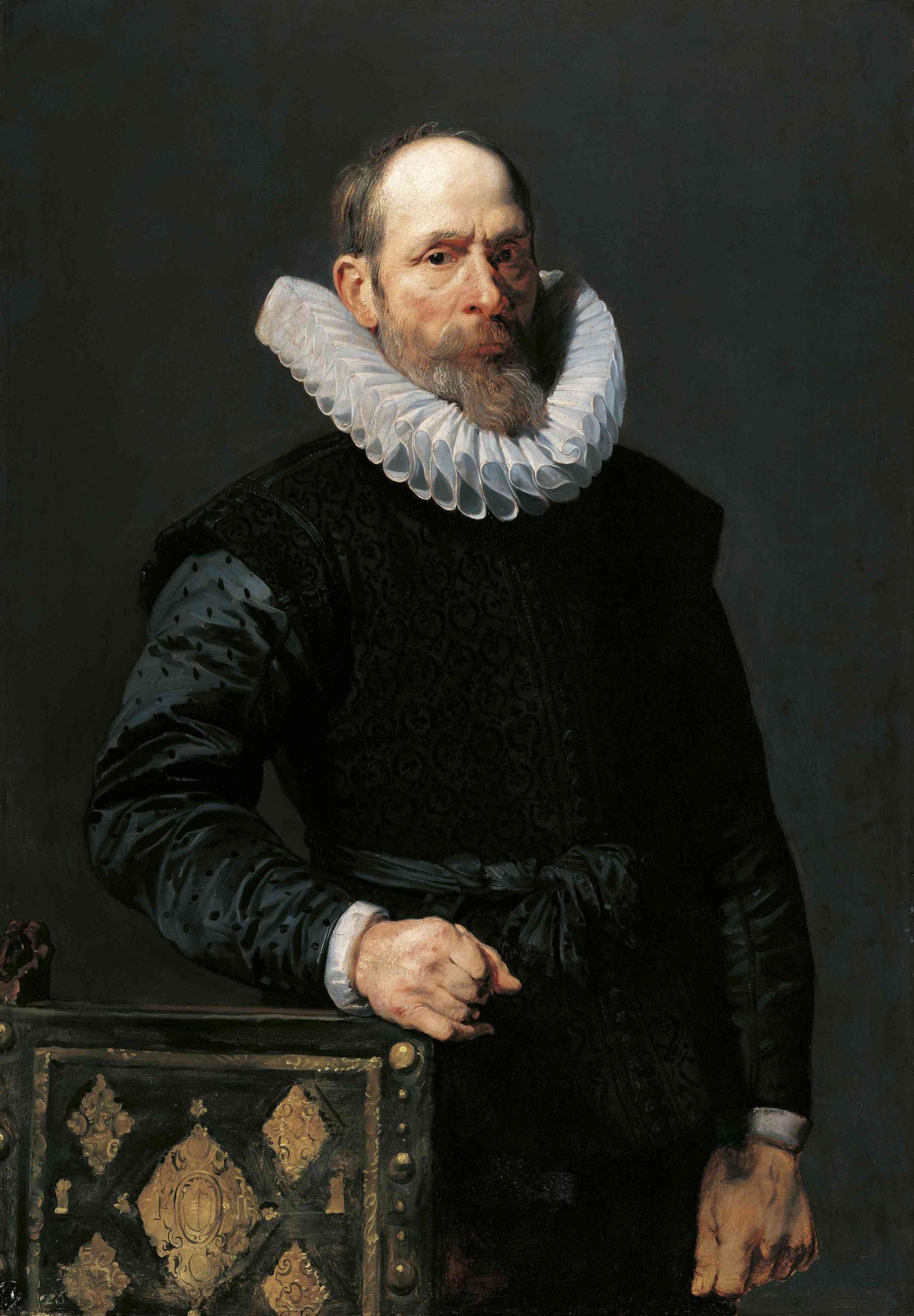
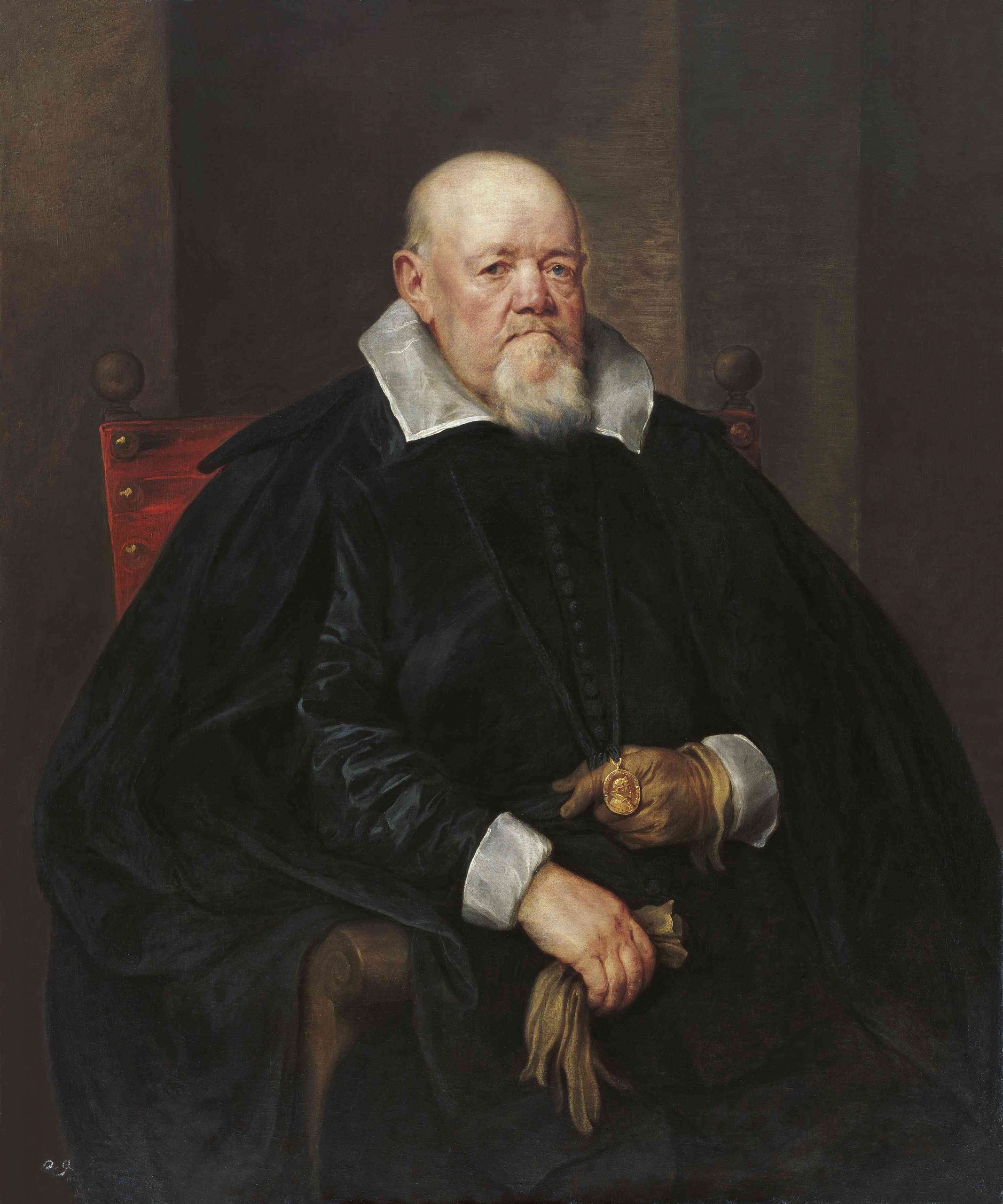
Three-quarter length portraits also belong to this type. There is the Portrait of an Old Gentleman in an Armchair (fig. 39).
As in the early period, the principal emphasis is on the superbly modelled head, in which the psychological expression is excellently rendered. The impression of clumsiness in the coarse features of the obviously apoplectic man, is contradicted by the very lively glance of the left eye in particular, whose dark-blue colour appears more vivacious than the somewhat dull and lack-lustre right eye. The red spot on the back of the chair and the brown of the gloves give accents of colour to the deep black of the garments. The rich modelling of the reddened face was achieved by the completely smoothed and softened colours. The artist goes back to the composition of the portrait of the Jacquemart-André museum (fig. 28) but he simplifies the background and thus achieves a greater concentration.
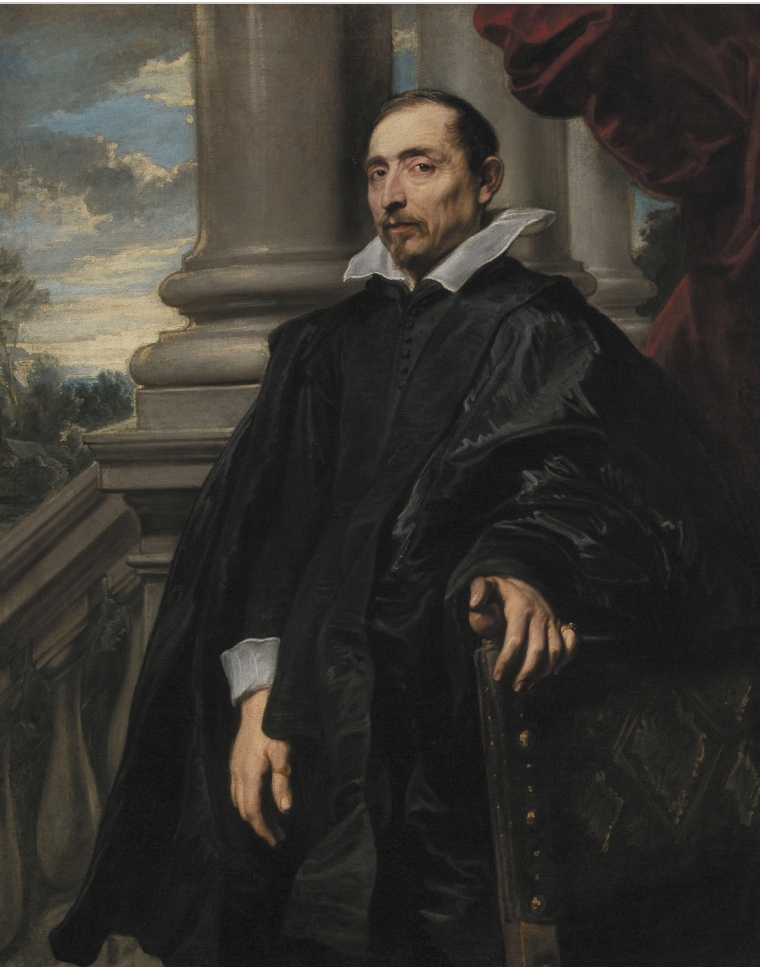
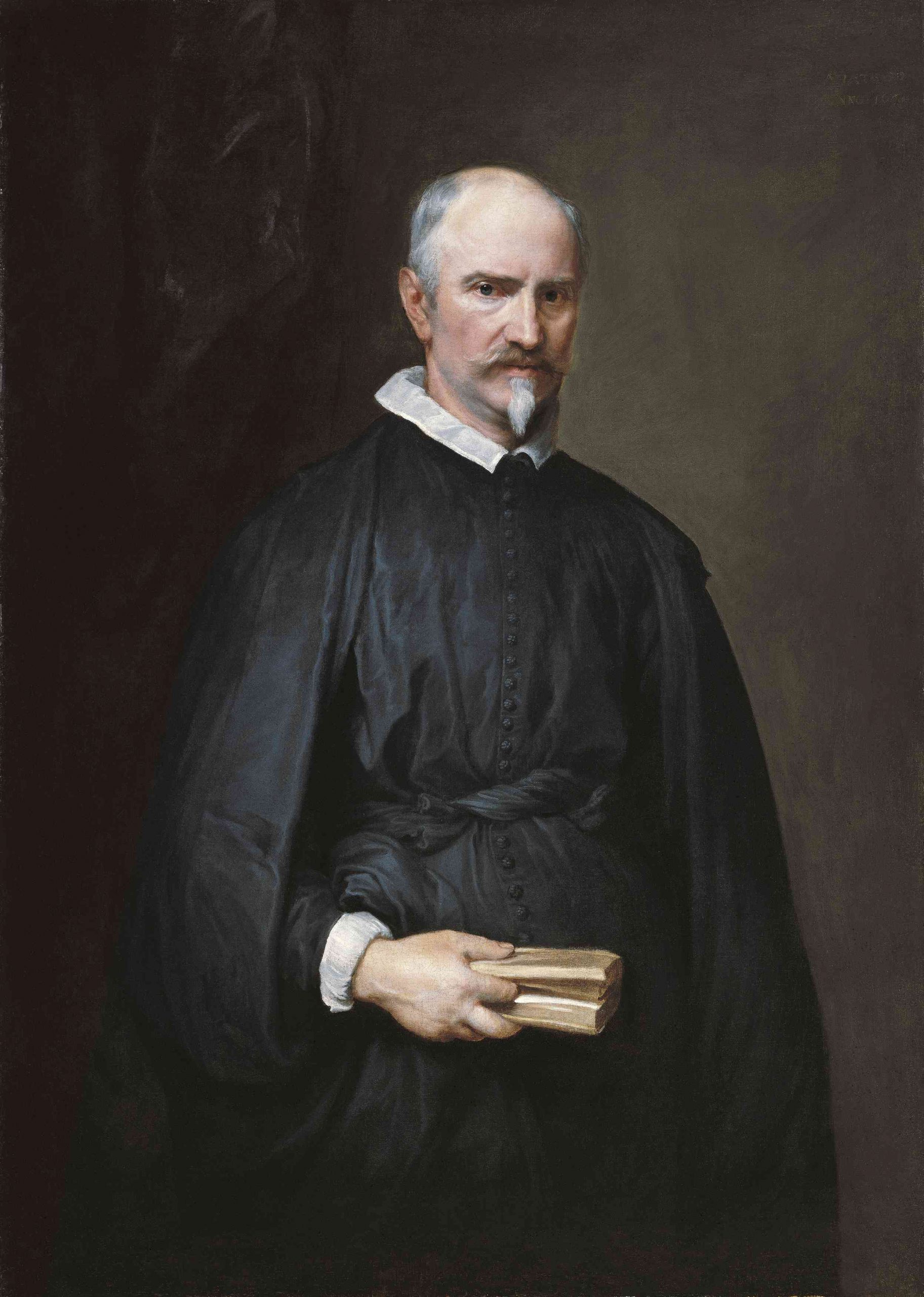
The technique is well recognizable in the Portrait of Canonicus Antonis de Tassis (fig. 40).
Extremely true to life is the figure against the purely decorative background (this portrait was lengthened on the lower side, but this part is now covered by the frame). In the rendering of the psychological element van Dyck has one of his happiest issues here. This man has the head of a choleric. And there is a real directness in the posture. This note is neither produced by a suddenly averted glance, nor by the strong gesture of the hand, as in the Italian Nobleman (fig. 36). It seems as if the model stopped walking for a moment. He had been interrupted in the reading of a small parchment volume. However, he leaves his finger in the book, in order not to lose his passage. The painting proves that van Dyck always achieved the most fertile effects by the simplest means.
The profound study of character is one of van Dyck’s greatest achievements. It is irrelevant for the work whether the portrait of the sitter actually reveals his soul to us or whether the artist resorted to the fount of his own soul, and thus endowed the sitter with his own conception. The only important thing is that we are looking at the modern impression of an individuality. It is for the first time in the history of the fine arts that we encounter that individualistic, psychologically deepened conception of portraiture, which is so characteristic of the second half of the 17th Century and of the whole 18th Century.
It was only after 1630 that an artist of the same age and another somewhat younger, both probably in the knowledge of van Dyck’s solutions, surpassed these achievements. They were the greatest of all portraitists and the most profound painters of human nature: Velasquez and Rembrandt.
The portraits of van Dyck’s second Antwerp period are still on the same artistic level that he reached while in Italy. After this period, the artist was primarily interested – as during the Genoese period – in full length portraits. His portraits, as in the case of Velasquez, followed closely the lines of the earlier equestrian portraits by the young Rubens. Some of van Dyck’s solutions are remarkable.
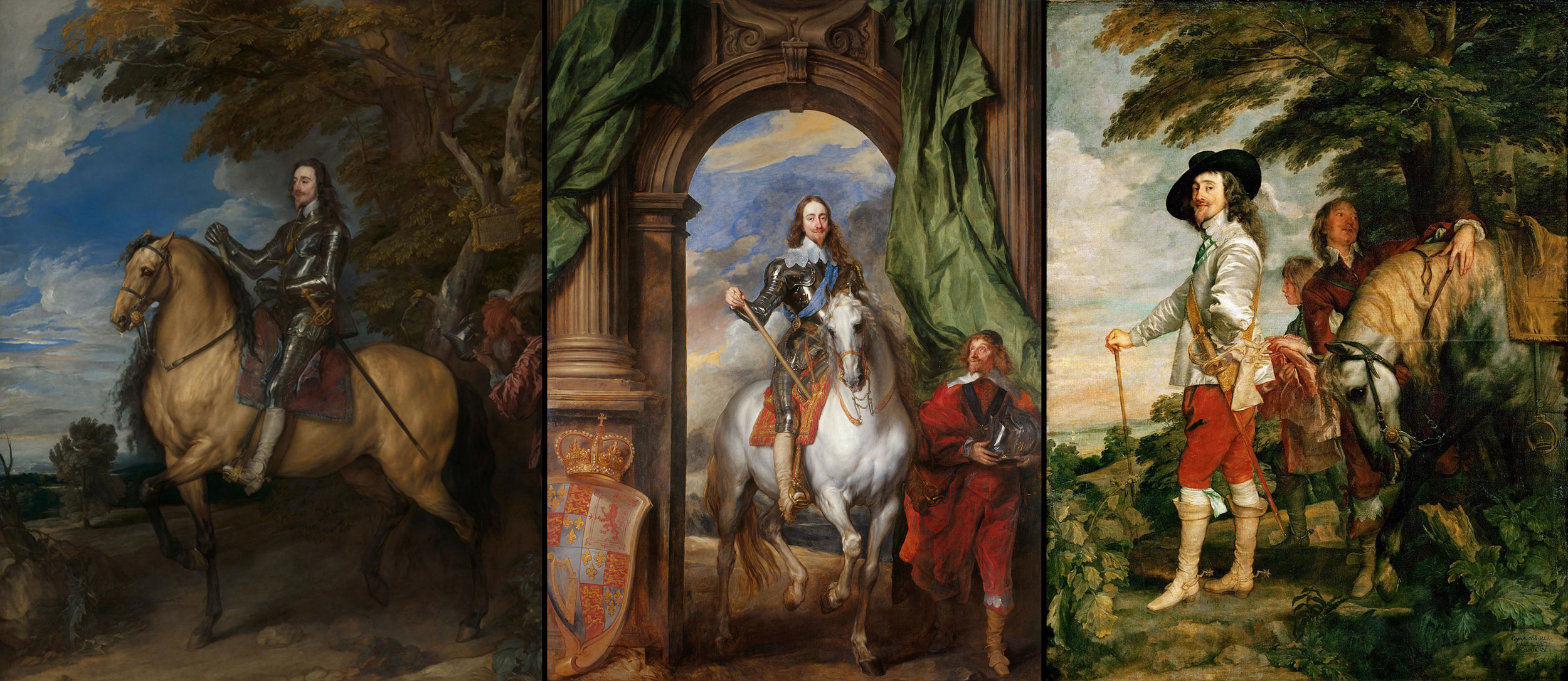
A new feature was the close connection of the sitter with the landscape. Even though the art of Rubens and that of Titian still exerted their influence on van Dyck’s large equestrian portraits – as those of Charles I of England, National Gallery, London (fig. 41) and Windsor Castle (fig. 42) show – the solution of showing the King as standing at the horse’s head (Paris, Louvre) is and was both new and original (fig. 43).
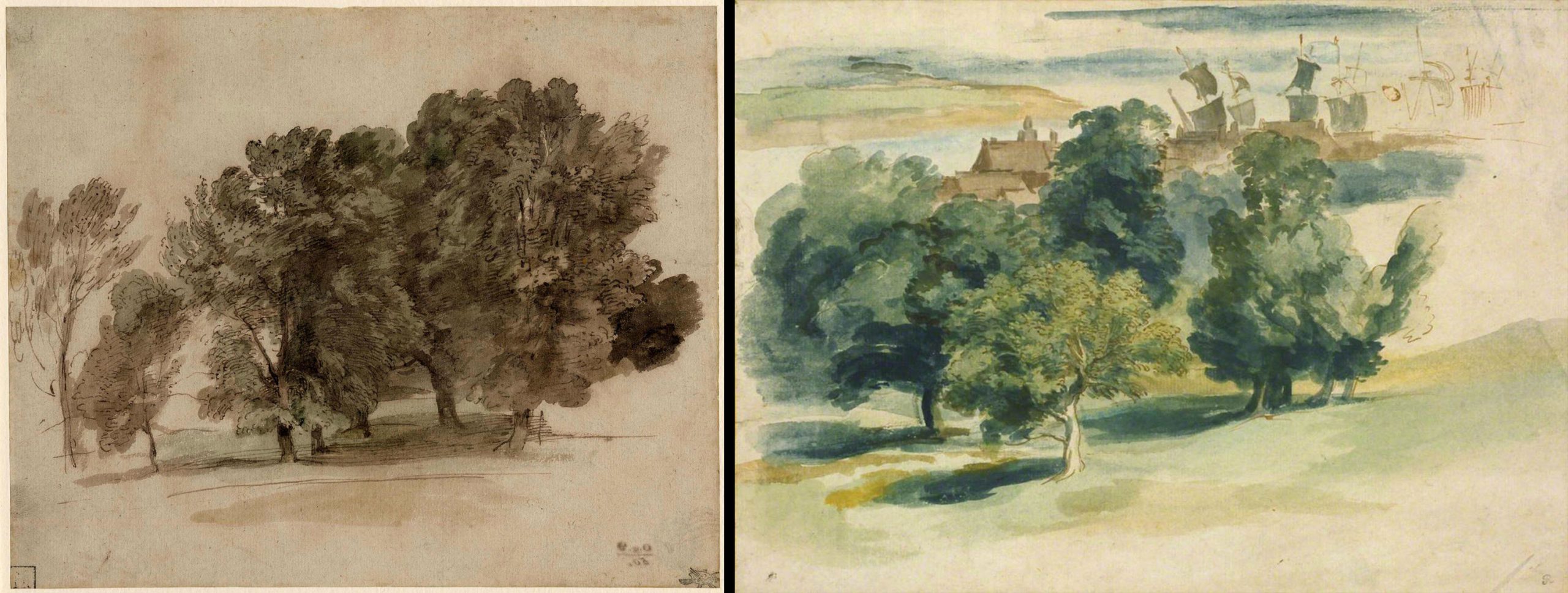
It corresponds to the cavalier ideal and, at the same time, affords a more direct connection between the object and the landscape, with which the artist occupied himself at this time, creating wonderful watercolours (British Museum, London: Barber Institute, Birmingham, etc. (figs. 44, 45)).

After this masterpiece, the Portrait of Charles I, in the Louvre, van Dyck’s landscape background became rather conventional, decorative drapery – frequently in green colour – being spread over rocks simply to obtain pleasing lines and striking contrasts in colour. This kind of background is also adopted in the three-quarter length portraits.
Not only because of the conventionalism of the motifs but also because of the more superficial rendering of the psychological expression, van Dyck’s English period must be regarded as a time of decline. The tracing of the gradual progress of this decline might perhaps necessitate corrections in some of the dates of certain works – at present dated in accordance with external marks, as, for instance, the age of the models. Considering the fact that the age must mostly be judged by the outward appearance only, as seen through the artist’s eyes, the estimation seems a difficult and thankless job. In any case, in 1634, the artist was – at least sometimes – still in full possession of his artistic powers, as shown in the sound and carefully painted Portrait of an elderly woman at the Vienna Museum (fig. 46).
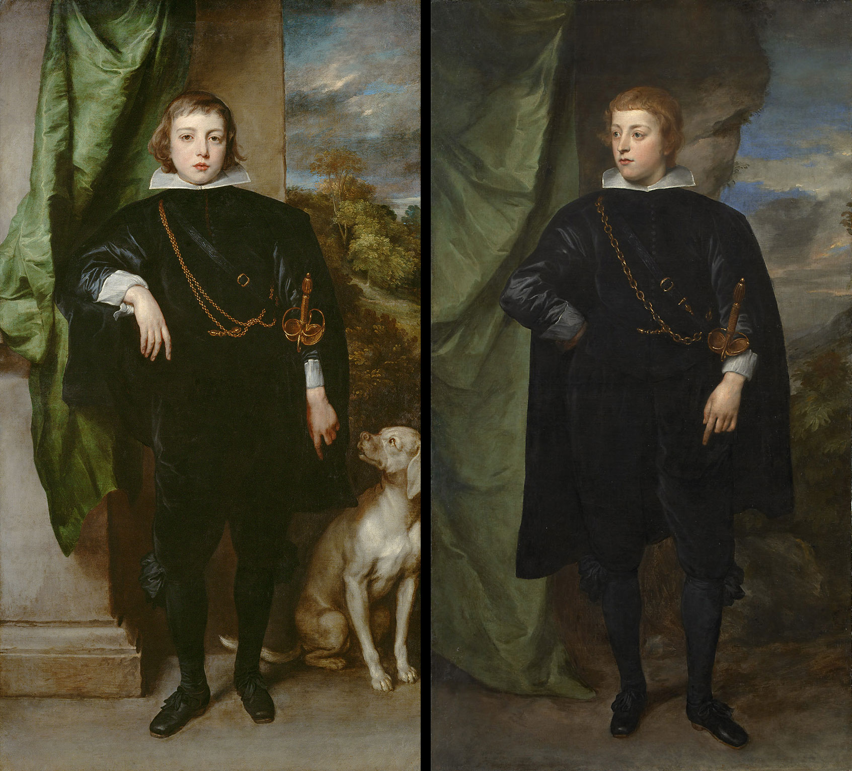
Van Dyck’s artistic powers are clearly on the decline and levelling off into routine in the superficially painted portraits of the two Palatine princes of the same collection (figs. 47, 48). It remains a moot point whether the portraits of young princes were painted shortly after 1634 (the princes were born in 1617 and 1619) or whether the decline of the artistic potency occurred in curved line. In this case the marvellous workmanship of the Vienna woman’s portrait of 1634 would only mark a momentary revival of the old potency.
It is the slightly superficial pleasantness of the portraits of the English period which exercised its influence on numerous successors until up to the 19th Century. The artistic significance of van Dyck’s portrait-art, however, rest, above all, with his creations of the Twenties.
a. Biography of Ludwig Baldass (1887-1963), Tate Gallery website, https://www.tate.org.uk/art/artists/ludwig-baldass-25752
b. Letters from Baldass to Motesisczky, The personal papers of Marie-Louise Motesiczky, Tate Gallery Archives, TGA 20129
c. Biography of Marie-Louise von Motesiczky, Marie-Louise von Motesiczky Charitable Trust website, https://www.motesiczky.org/biography/
1. I wrote this essay even before my observations were facilitated by the fact, that in 1948 several of the paintings, which are in excellent condition, were cleaned in an exemplary manner freed of super-imposed repaint (principally caused by van Dyck’s granular priming in canvas paintings), and regenerated by Prof. J. Hajsinek.
2. L’oeuvre de P.P. Rubens 5 vol., Antwerp, 1886-1892.
3. Ant. van Dyck in der Liechtensteingalerie, Die graphischen Künste, XII, Wien 1888 “In diesem Bilde ist aber auch jeder Zoll ein Rubens.”
4. “Von packender Wahrhaftigkeit.”
5. [Ed. Note] Nora De Poorter in Susan J. Barnes, Nora De Poorter, Oliver Millar, Horst Vey. Van Dyck.A Complete Catalogue of the Paintings, Yale University Press, New Haven and London, 2004, p. 121, no. I. 133.
6. Erinnerungen ans Rubens, Basel, 1898.
7. [Ed. Note] Nora De Poorter considered this painting to be a good contemporary copy of a portrait of Jan Wildens, oil on canvas, 75 x 58 cm, formerly in the Kunsthistorisches Museum Vienna, which went missing during the Second World War, Barnes et al., op. cit. n. 5, p. 103, under no. 109.
8. [Ed. Note] It is not immediately apparent as to which painting Baldass was referring to.
9. Die Vornehmsten Kunstdenkmäler in Wien I.
10. I do not think it proper to draw conclusions as to the earlier or later origin of the works of the first period by basing judgment on the treatment of details, such as the handling of the collar, or the more or less visible stroke of the brush. In all probability, although he wished to appear sure of himself, the artist was still experimenting and therefore tried, abandoned and again took up technical tricks.
11. pp. 121-123.
12. The red background, incidentally, recurs during the second half of the twenties in the Portrait of the Duchess of Buckingham (fig. A) at the Dulwich Gallery. The somewhat damaged condition of that work, however, precludes any definite judgment as to whether it was completed or left unfinished.
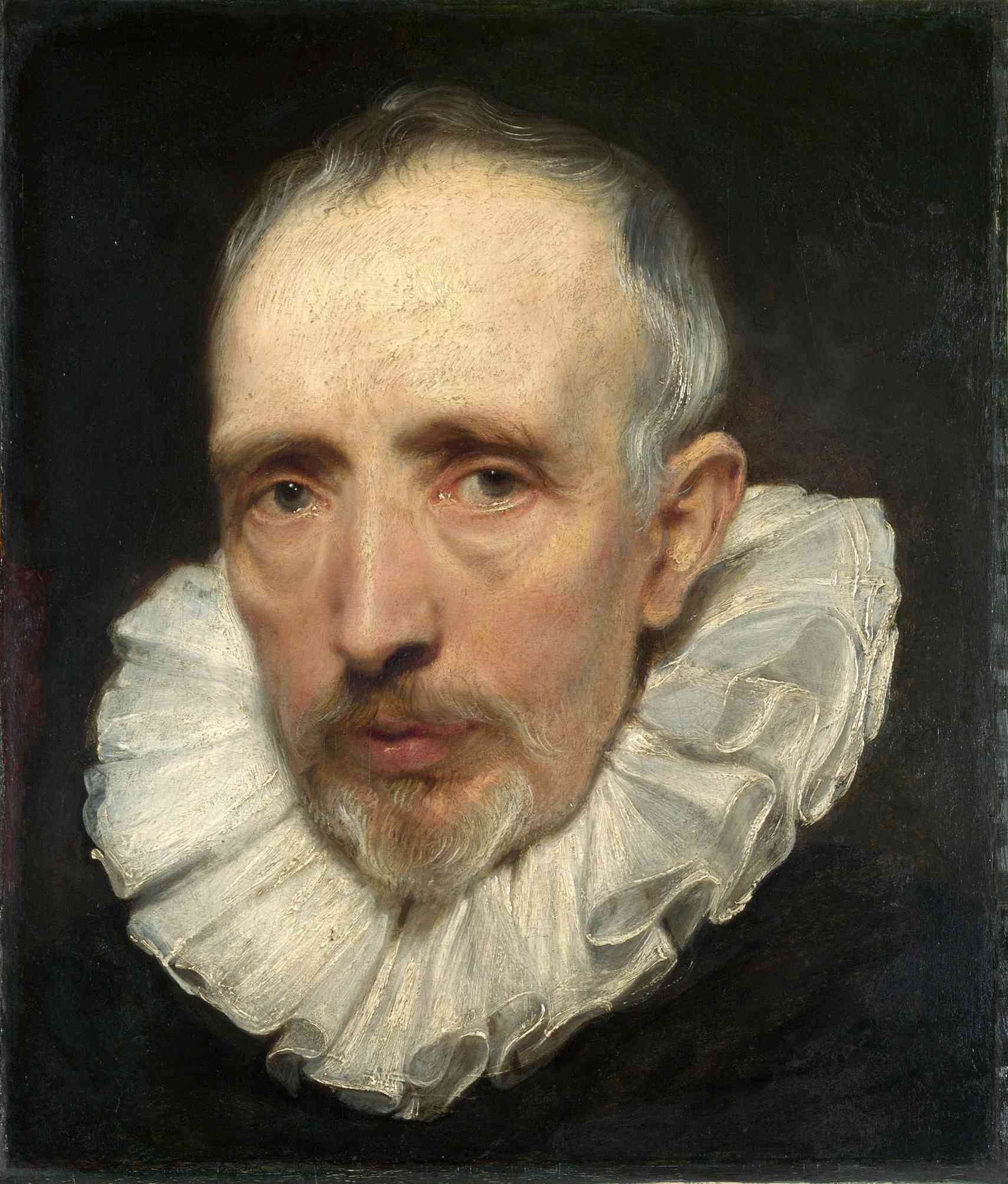
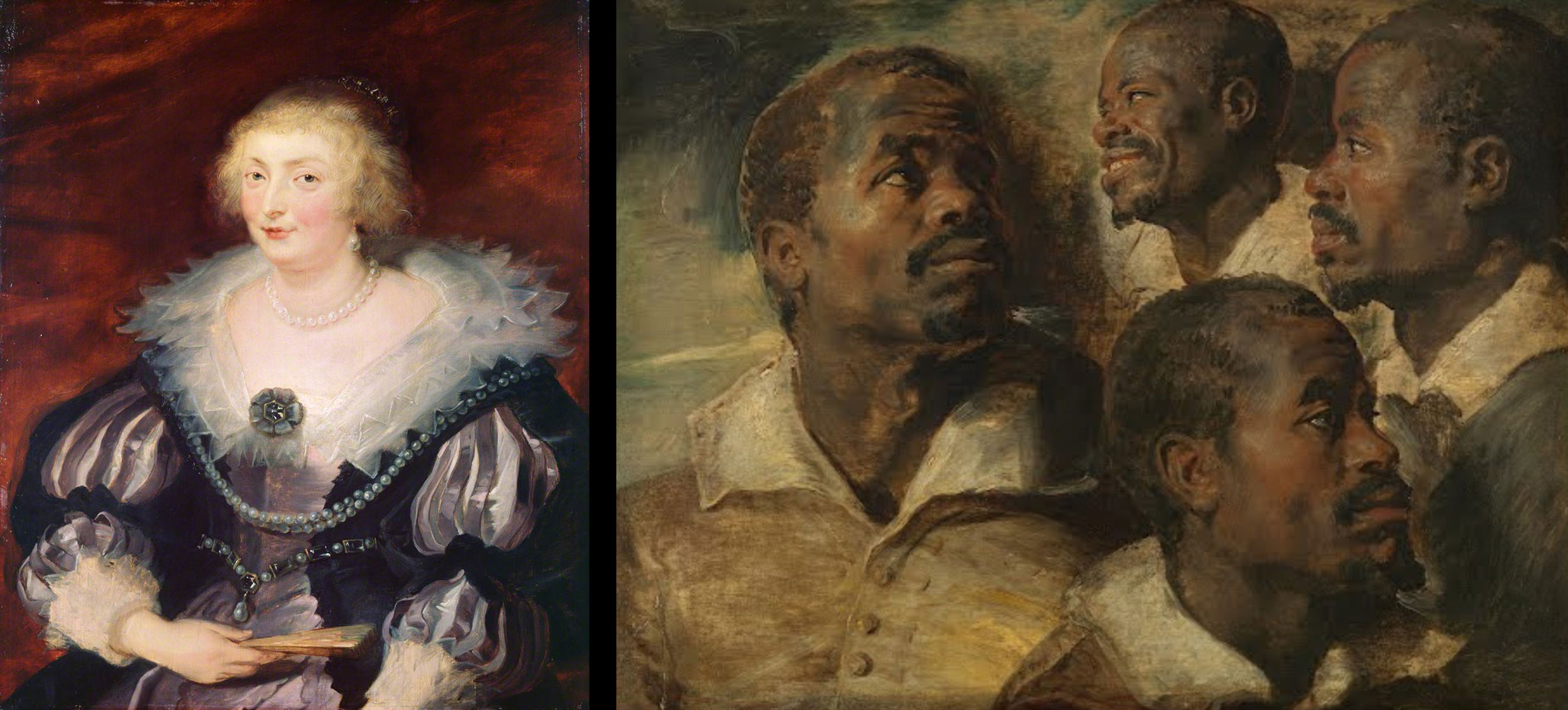
13. It is for this reason that the painter also tried his hand at physiognomic studies. On the panel (Museum, Brussels), for instance, he painted the head of the same negro four times, not only in order to obtain different views of his face, but also to catch the expression of changing moods (fig. B). [Editorial note: this head study is now attributed to Rubens].
14. Cf. H G. Evers, P.P. Rubens, Munich, 1942, p.90.
15. The young P.P. Rubens at Genoa (Cf. Ludwig Burchard, Genuesische Frauenbildnisse von Rubens, “Jahrbuch der preussischen Kunstsammlungen,” Berlin, 1929, pp. 319 ff.) used a similar motif. There, however, it is not only suggested, as with van Dyck in the companion-portraits at the Liechtenstein Gallery, but full developed. Most richly and magnificently robed ladies of the high aristocracy, are sitting or standing on the terrace of their palace, whose portico with its numerous fluted columns is protected against the sun or a draught by heavy curtains. Rubens took up the same motif, pompous, but significant in the portrait, in 1620, of the Count and Countess Arundel which is now in Munich (fig. C).
Thus, Rubens placed his noble sitters in their proper setting. Van Dyck, however, not yet having seen Rubens’ female portraits of the Genoese period, found a solution which appears like a condensed version of Rubens’ magnificence. He showed only the base of a column, a part of a curtain, and a patch of the sky. This background, moreover, forms a contrast to the patrician garments of the figures.
16. [Ed. Note] http://jordaensvandyck.org/new-discovery-van-dyckss-portrait-of-dutch-golden-age-painter-pieter-soutman/
17. This sword seems to make the attempted identification of the painted person doubtful. If it was possible for van Dyck to paint the medal maker Jan van Montfort with a foil, it is because he was a dignitary at the court of Brussels. But it is unlikely that he would have given arms to Paul de Vos, the animal painter, when he had painted his other fellow painters without swords.
18. [Ed. Note] The attribution to Van Dyck was challenged by Nora de Poorter, Barnes et al., op. cit. n. 5, p. 128, under no. I. 46.
19. Besides, Ludwig Burchard (Op. cit., n. 15) was fully justified in pointing out the strong influence which Rubens’ full-length female portraits of his Genoese period exerted on a number of van Dyck’s paintings of the same type, dating from his stay in Italy.